MICHR Website Redesign
Context
Michigan Institute of Clinical & Health Research has been awarded an NIH grant with the purpose of advancing Translational Science. This grant is aimed towards identifying roadblocks in the scientific and operational research that hinder research investigators. The goal is to accelerate the research process from its inception to dissemination.
Our Goal
To redesign a desktop- and mobile-accessible website that educates users on the transition from Clinical Translational Research to Translational Science, while improving navigation and ensuring key information can be found within 2–3 clicks.
Our Response
We redesigned MICHR’s digital experience by mapping user journeys across the research pipeline, identifying key barriers and facilitators, restructuring navigation, and refining content to clearly communicate the shift to Translational Science. Through accessibility improvements, responsive layouts, and iterative user testing, we created a website where users can easily orient themselves and find information within 2–3 clicks.
Project Details
Working Team: Innovation Team, Vendor Developers, Communications, UX Lead
Stakeholders: Leadership, ITS, MICHR Program Teams, End Users
Timeline: 9 months
Scope: UX Research, UX Design, Information Architecture, Analytics, Development Collaboration, Launch Support, Site Maintenance
My Role: Lead UX Designer, Project Manager
User Research
Methods: Heuristic Evaluation, Gap Analysis, Empathy Interviews, Thematic Analysis, Empathy Maps, Personas, User Journey Maps
Tools: Zoom, Miro
Information Architecture
Methods: Content Inventory, Content Audit, IA Research, Stakeholder Engagement, Decision Workshops
Tools: Google Sheets, Miro, In-Person Workshops
UX Design
Methods: Sketching, Wireframing, Prototyping
Tools: Paper Prototypes, Figma, Adobe Creative Suite
Development & Testing
Methods: User Testing, Vendor Collaboration for Website Development, Website Maintenance Support
Tools: Zoom, Dovetail, WordPress
Key Project Highlights
1. Timeline Pressure & Deliverable Prioritization
Successfully delivered the redesign under a compressed schedule, requiring strategic prioritization of tasks and continuous alignment with leadership expectations.
2. Cross-Functional Coordination with External Partners
Collaborated closely with ITS, external vendors, and internal program teams, navigating differing workflows and communication styles to maintain momentum and design cohesion.
3. Mid-Project Pivot Based on Stakeholder Insights
Adjusted project direction midstream based on evolving stakeholder expectations and research findings, demonstrating flexibility and user-centered decision-making.
4. Intern Transition & Knowledge Continuity
Onboarded and coordinated with interns early in the project; managed knowledge transfer as team composition shifted near the project’s end to preserve continuity and maintain progress.
5. Deployment Before Full Communication Alignment
Facilitated an early go-live that occurred ahead of complete alignment across all stakeholders due to miscommunication, creating a real-world lesson in release coordination between design, technical, and operational teams.
6. Vendor & Stakeholder Negotiation Under Constraint
Managed ongoing vendor relationships and stakeholder expectations across units with differing priorities, ensuring that design quality and user experience goals stayed intact despite external pressures.
How might we?
Communicate the role of MICHR in catalyzing research and advancing the study of TS
Educate users about the transition from CTR to CTS
Demonstrate the impact in the community as well as disseminate best practices to other institutions
Design Process & Methods
-
Contextual Inquiry
Contextual inquiries were conducted with end users to explore their experiences and frustrations with the current website. Insights from these conversations informed and refined our interview guide for subsequent research.
-
Gap Analysis
By analyzing websites across the consortium, we identified key gaps in MICHR’s structure and presentation. These findings shaped our design direction and informed early IA decisions.
-

Heuristic Evaluation
Using Nielsen Norman’s 10 Usability Heuristics, we identified several usability issues: unclear messaging, overly complex navigation with too many paths, and system behaviors that failed to match users’ mental models.
-
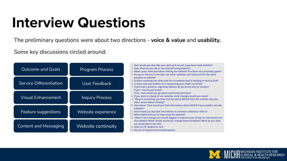
Empathy Interviews
We conducted 20 empathy interviews: 3 with leadership, 12 with program users, and 5 with external users. Participants were recruited through internal MICHR programs and channels. Each 60-minute Zoom interview explored key aspects of the current website experience, including usability, navigation, clarity of educational content, visual expectations, and overall user perception.
-
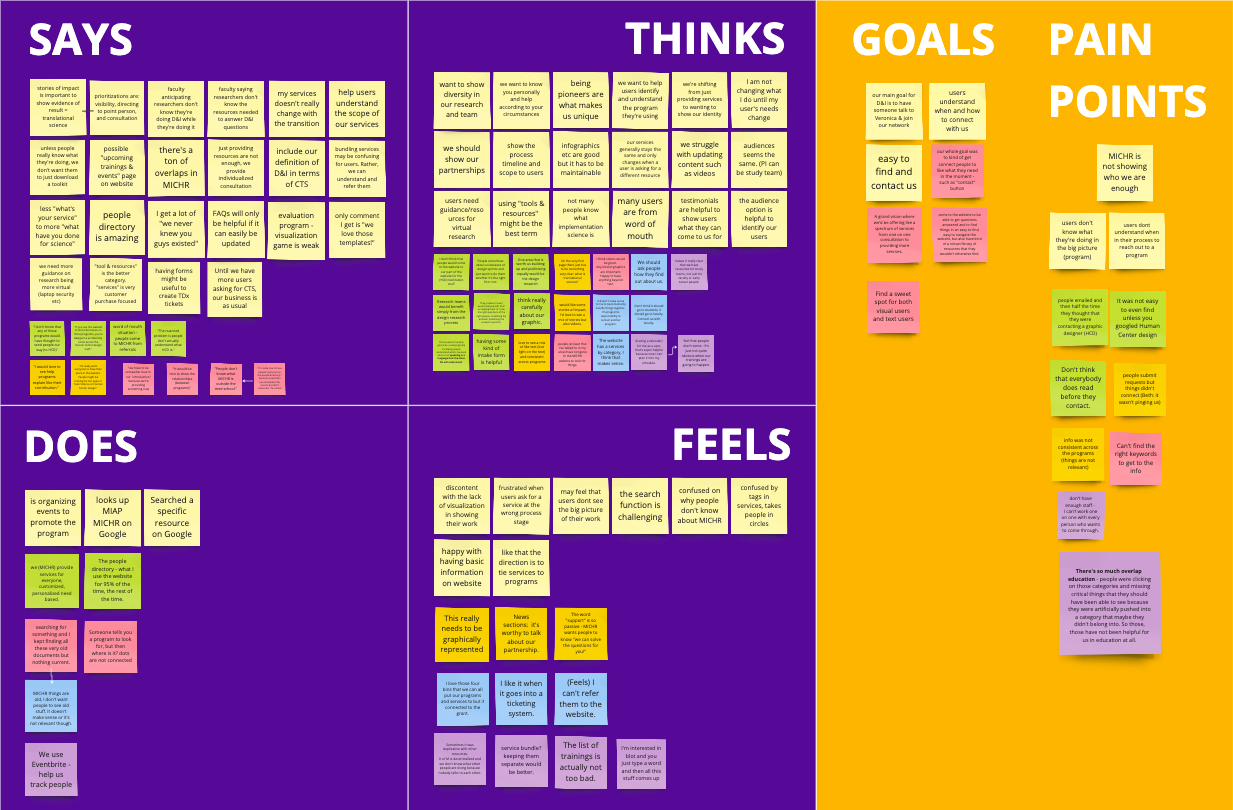
Empathy Maps
Empathy maps helped us synthesize patterns across user groups. They highlighted that users wanted fast, intuitive access to information; program teams valued increased visibility; and leadership focused on effectively communicating the shift from CTR to TS.
-
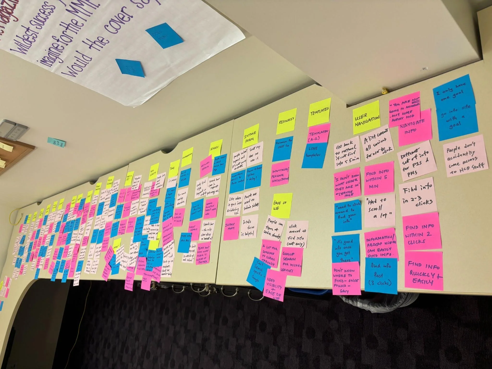
Thematic Analysis
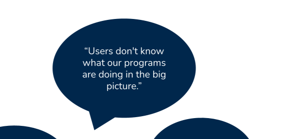
Through thematic analysis, we coded and categorized interview data to surface recurring themes. A major finding was that users lacked clarity on the transition from CTR to TS and needed more explicit guidance and education.
-
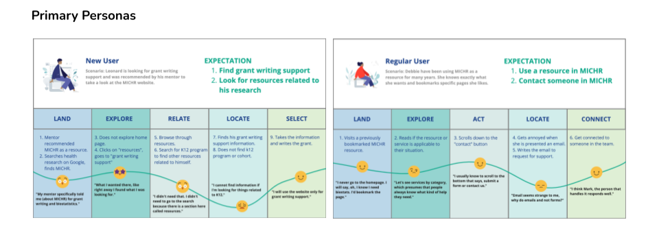
User Personas + User Journeys
We created primary personas (New Users, Regular Users) and secondary personas (PIs/Mentors, MICHR Programs) to represent key user groups. Their shared needs included intuitive navigation, clear content organization, and quick access to information. User journey maps highlighted barriers and opportunities across their workflows.
-

Wireframes
We began with quick sketches to explore a program-based structure and organize extensive site content. These evolved into low- and mid-fidelity wireframes in Figma focused on 2–3 click navigation and clearer education around the CTR to TS transition.
-

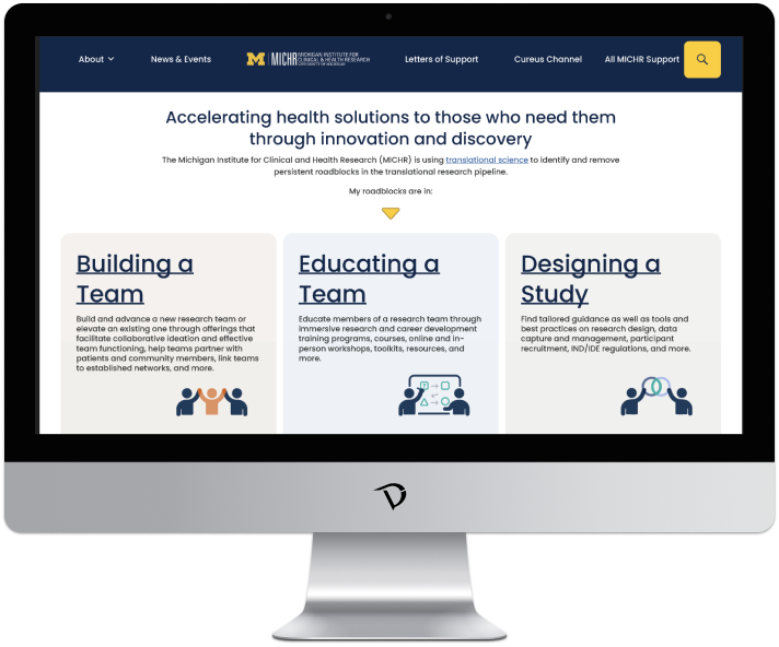
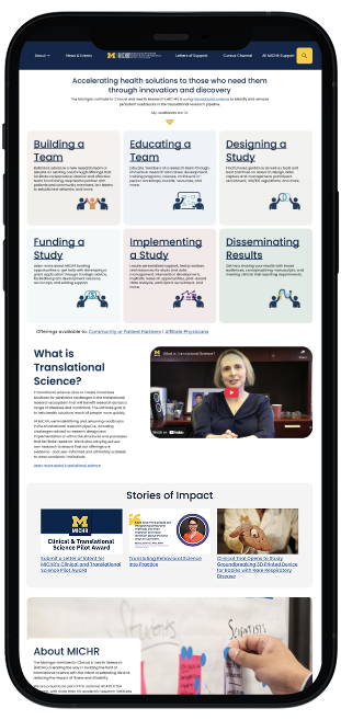
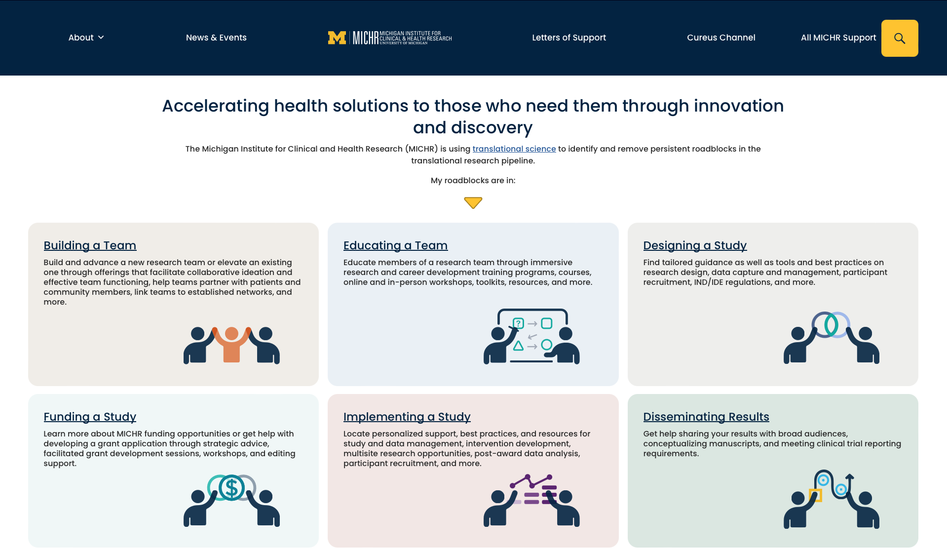
Information Architecture
Our information architecture shifted from a program-based structure to an offerings-and-resources framework aligned with roadblocks in the translational research pipeline. This approach organizes content around user needs and helps users find relevant information more intuitively within these key areas.
-
User Testing and Data Synthesis
User testing with 17 participants including primary investigators, MICHR staff, community members, and patient partners, revealed unclear terminology, responsiveness issues across screen sizes, and areas for improved accessibility. Qualitative data synthesis also surfaced distinct needs across user groups, underscoring the importance of more tailored accommodations.


Solution
A redesigned website grounded in a clear offerings-and-resources framework aligned with the translational research pipeline. The new design provides an intuitive, user-centered experience that better communicates MICHR’s mission and services.
Key system features:
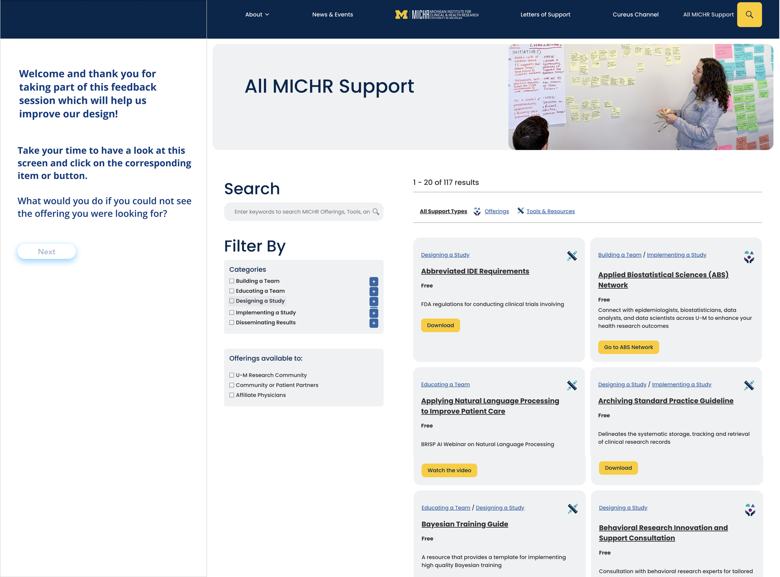
Simplified navigation to ensure key information could be accessed within 2–3 clicks
Improved accessibility, responsive layouts that support diverse user groups. Step-by-step instructions for tasks and educational videos
Pipeline-based content categories for faster scanning and easier identification of key information
Filters designed by category, audience, and guiding questions to help users quickly identify relevant offerings, with alphabetical ‘All Offerings’ and clear call-to-action buttons for easy engagement
Clarified terminology
Snapshot view designed for quick access to key information, enabling fast orientation and seamless navigation.
Key Takeaways
-
User needs must guide structure, not internal assumptions
Redesigning the IA required challenging our initial mental models and restructuring content around what users actually sought, not how programs were internally organized.
-
Clear organization reduces cognitive load and improves findability
Aligning content with the translational research pipeline created more intuitive pathways, allowing users to locate offerings and resources with significantly less effort.
-
Diverse stakeholders reveal blind spots and broaden perspective
Collaborating with leadership, program teams, ITS, and end users exposed differing needs and expectations, strengthening the final solution and ensuring it worked across audiences.